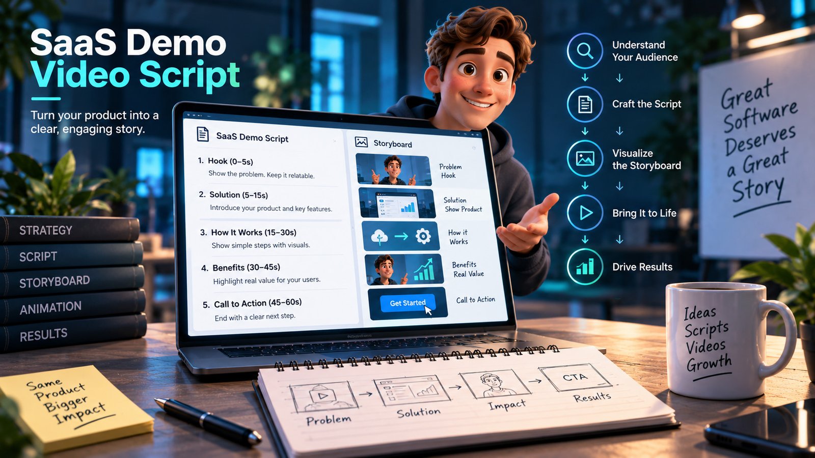
Script a SaaS demo around one realistic job completed from start to finish, not around your navigation. Open on the moment of friction, show the workflow in the order a stranger would perform it, name the one thing that makes your product different, and end on the completed outcome. Two to four minutes, built in modular scenes so a UI change means re-rendering one section.
Key facts
- Structure: friction, first action, workflow to completion, the differentiator, outcome, next step
- Length: 2 to 4 minutes for the main demo, with 30 to 60 second cuts of single features
- Order: the order a user would work in, never the order of your navigation menu
- Data matters: realistic names, realistic numbers. Test Test and Lorem Ipsum destroy credibility instantly
- Cut: settings, admin, permissions, pricing tiers and anything a first-time viewer would not do first
- Build modular: one scene per stage, so a redesigned screen costs one re-render rather than a reshoot
On this page
Why most demo scripts fail before a frame is animated
The default demo script is a tour. Here is the dashboard. Here is the projects area. Here is reporting. Here is settings.
It fails because it is organised around your product's structure, and the viewer has no mental model of that structure yet. They cannot tell which parts matter. A tour hands somebody a floor plan when they asked for directions.
The fix is a change of subject. A demo is not about the software. It is about a job, and the software happens to be how the job gets done.
The structure that works
1. Open on the friction, in under fifteen seconds. Not the logo, not the value proposition, not a feature list. The moment of annoyance the viewer recognises. "Three people, four spreadsheets and nobody knows which one is current." If they nod, they will watch the next two minutes.
2. The first action, immediately. Get into the product fast, on the specific action that begins the job. Not the login screen. Not the empty state. The first thing a person does when they are actually trying to get something done.
3. The workflow, in a stranger's order. One realistic task, start to finish, in the sequence a person would perform it. If three steps happen in a row in real usage, show three steps in a row. The temptation to jump to the impressive screen is the thing to resist, because the impressive screen only means something once the viewer understands how someone arrives there.
4. The one thing that is different. Every demo has one moment where the product does something the alternatives do not. Slow down there. Give it ten seconds when everything else got three. This is the only part of the video a prospect will repeat to a colleague.
5. The outcome, shown. End on the finished thing: the report sent, the deal closed, the shift scheduled. The viewer needs to see the job done, not to be told it would be.
6. One next step. One. Start a trial, or book a demo, or read the docs. Two calls to action perform worse than one.
What to cut
| Cut this | Why |
|---|---|
| Settings and configuration | Nobody evaluates software on its settings screen |
| Admin and permissions | Matters at procurement, not in a demo video |
| Integrations not asked about | Sounds like scope, reads as complexity |
| Pricing | Belongs on a page where it can be read slowly |
| Feature completeness | A list of everything says nothing about anything |
| The login screen | Costs four seconds, teaches nothing |
The test for every scene: if this were removed, would the viewer be unable to follow the job? If they would still follow it, it goes.
The details that decide credibility
Use realistic data. Not Test User, not Lorem Ipsum, not $1.00. Build a demo dataset with plausible names, sensible dates, believable numbers, and reuse it across every video. Fake-looking data tells a viewer that nobody has ever used this for real, which is precisely the doubt the demo exists to remove.
Name the roles. "Sarah in accounts receivable" is easier to follow than "the user". It also forces the script to decide who the video is for.
Do not narrate the interface. "Click the blue button in the top right" ages badly and adds nothing. Say what is being achieved and let the motion show where.
Slow down on the moments that matter, speed up on the rest. Real demos have uneven pacing because real attention is uneven. A video at one constant speed reads as a manual.
Illustrative scenario, not a specific client. A workflow tool has fifty features and a three-minute budget. The script covers four of them, chosen because they are the four a new customer touches in week one, and follows a single scheduling task from a manager's request through to a published rota. The other forty-six features are not mentioned. The demo converts better than the previous version, which had covered eleven features, because a viewer who follows one job to completion believes the product works, while a viewer shown eleven things believes nothing in particular.
Build it so it survives the next redesign
Software changes faster than video does. Two decisions at script stage decide whether your demo is an asset or a liability in nine months.
Modular scenes. One scene per workflow stage, rendered separately. A redesigned screen becomes one re-render, not a rebuild. This is the single largest factor in the total cost of owning a demo video.
Position-independent narration. Scripts that name button locations, menu labels and colours break the moment the design system moves. Scripts that describe outcomes survive.
More on how the studio structures this on the SaaS and product videos page.
Produce the cuts at the same time
From one master, at marginal cost:
- A 60-second version for paid social and the homepage.
- Three to five 30-second single-feature cuts for sales emails and feature
pages.
- Vertical and square crops of the short cuts.
- Silent versions with on-screen text for sound-off placements.
Commissioning these later as separate projects costs several times more than specifying them in the original brief, because the assets, the voiceover and the dataset all already exist.
Timeline and cost
A demo of this shape takes roughly the same as any 60-second explainer, two to four weeks, with the script and storyboard approval accounting for most of the variance rather than the animation. Getting the script right is where the schedule is won or lost.
Demos and video series are quoted individually rather than from the fixed package prices, because scene count and interface work vary far more than length does.
If you are still deciding whether a demo is even the right format, the comparison of explainer, demo and UI animation covers that decision first.
Send us the product and the job you want shown, and we will return a fixed price within 24 hours, over email, with no call required.