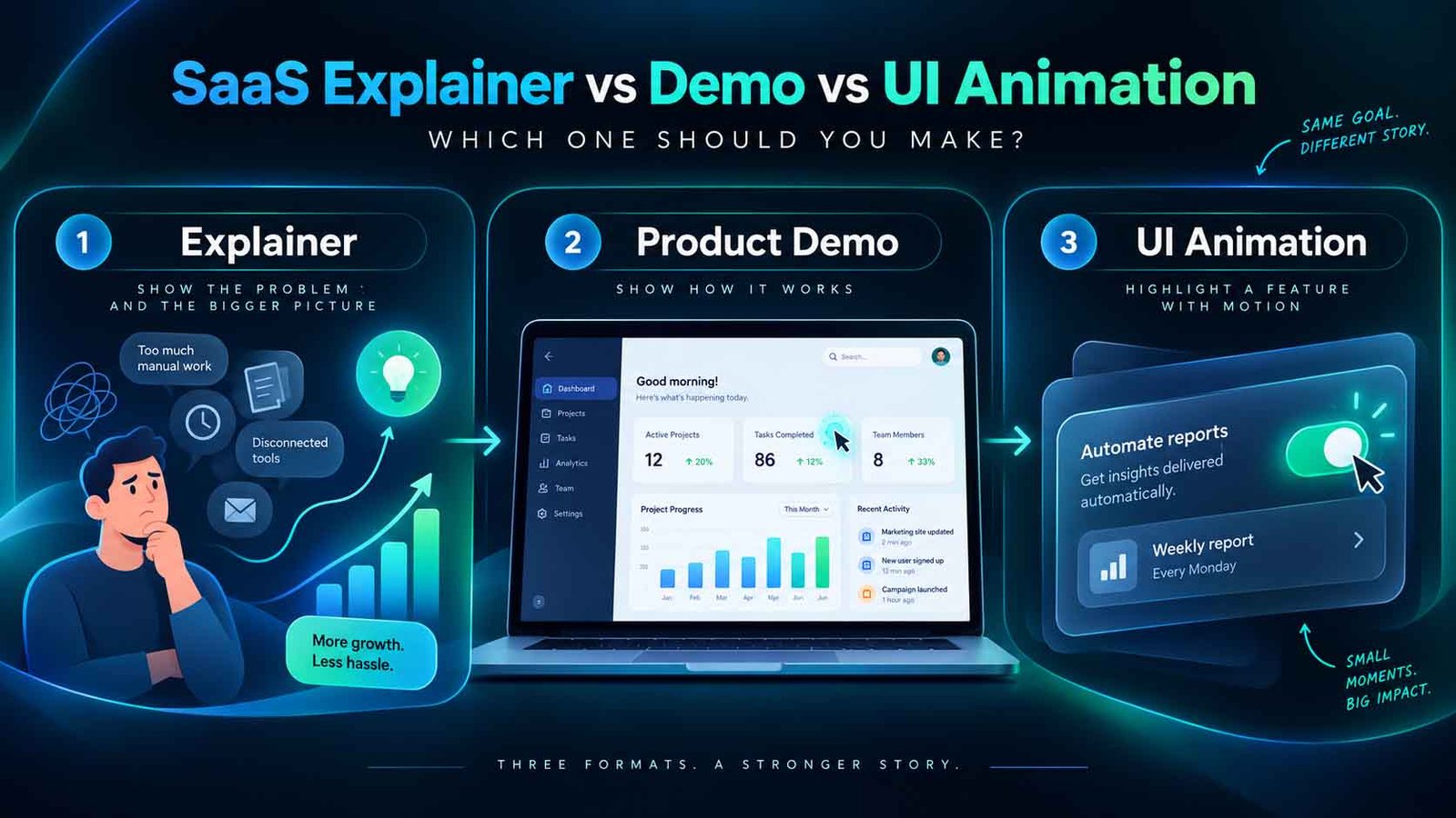
Make an explainer when the viewer does not yet understand the problem you solve, a product demo when they understand it and want to see whether your software does the job, and UI animation when they are already convinced and need one specific feature made clear. Most software companies need an explainer and a demo, and they need them to be different videos rather than one video trying to be both.
Key facts
- Explainer: 60 to 90 seconds, problem-led, no interface required, sits on the homepage and in paid ads
- Product demo: 2 to 4 minutes, interface-led, ordered for a stranger, sits on the product page and in sales emails
- UI animation: 5 to 30 seconds, one feature, no narration needed, sits in-app, in release notes and on feature pages
- The common mistake: one 3-minute video expected to do all three jobs, which converts on none of them
- Update cost: UI animation and modular demos survive a redesign. A single monolithic video does not
- Lucid Motion Studio pricing: from $340 for a 60 to 90 second explainer, demos and series quoted individually
On this page
The question behind the question
Software teams usually arrive asking which video to make. The more useful question is which viewer to make it for, because the three formats are not quality tiers of one thing. They are answers to three different sentences running through three different heads.
- "I did not know this was a solvable problem." → explainer
- "I have this problem. Does your thing actually do it?" → product demo
- "I am using this and I cannot work out how to do X." → UI animation
A video aimed at the wrong sentence does not underperform slightly. It gets closed.
The three formats side by side
| Explainer | Product demo | UI animation | |
|---|---|---|---|
| Viewer's state | Problem-unaware or solution-unaware | Evaluating options | Already a user, or deep in evaluation |
| Length | 60 to 90 seconds | 2 to 4 minutes | 5 to 30 seconds |
| Shows real UI | Glimpses only | Yes, throughout | Yes, one screen |
| Narration | Yes, voiceover-led | Yes, usually voiceover | Often none |
| Where it lives | Homepage, paid ads, social | Product page, sales emails, trials | In-app, release notes, docs, feature pages |
| Rebuilt when | Positioning changes | Workflow or UI changes | That feature changes |
| Job | Make them care | Make them believe | Make them able |
Explainer: sell the problem, not the software
The explainer's only job is to make a stranger understand what you do and why it matters, fast enough that they keep reading.
Its most common failure is starting with the product. A viewer who has not yet agreed that a problem exists has no way to evaluate a solution to it, so the first twenty seconds belong to the problem, described the way the viewer would describe it rather than the way your positioning document does.
Interface belongs in an explainer only as proof of existence. Two or three seconds of a clean screen, late, after the argument has landed. Not a tour.
This is also the format where animation earns its keep, because the problem being described is usually abstract, and abstract things are easier to draw than to film. It is covered in more depth on the explainer videos page.
Product demo: show the workflow, in a stranger's order
The demo is where the real interface has to appear, and where most SaaS video goes wrong.
The wrong instinct is to tour the navigation: here is the dashboard, here is settings, here is reports. That order comes from your product's information architecture, which the viewer has never seen and does not care about.
The right structure follows a job from start to finish. One realistic task, one realistic dataset, completed on screen, in the sequence someone would actually do it. A prospect is not asking what your product contains. They are asking whether it will do the thing they need to do on Tuesday.
That is a scripting problem before it is an animation problem, which is why it has its own article on structuring a demo.
Build it in modular scenes. Software changes; a monolithic three-minute render means the whole video ages together, while modular scenes mean one section is re-rendered when one screen changes.
UI animation: the cheapest video you will make, and the most reused
Five to thirty seconds. One interaction. Usually no voiceover, because it plays in contexts where sound is off and text is already on the page around it.
The uses are unglamorous and add up: onboarding tooltips, empty states, release notes, changelog entries, documentation, feature pages, and the short clips a sales engineer pastes into a reply.
It is also the format that keeps working when everything else ages, because re-recording one interaction is a small job. Teams that treat UI animation as a standing capability rather than a one-off project end up with a library, and the library is what makes the product feel maintained.
Illustrative scenario, not a specific client. A B2B SaaS company with a new category to explain and a complex onboarding flow has budget for roughly one video. Splitting it produces more: a 75-second explainer for the homepage and paid social, built around the problem with three seconds of interface at the end, and a 3-minute modular demo for the product page that follows one workflow to completion. Six 10-second UI animations come out of the demo assets at marginal cost, and go straight into onboarding. One production, three placements, and when the dashboard is redesigned six months later only two demo scenes need rebuilding.
How to choose, in four questions
- Does your buyer already know this problem is solvable? If no, explainer
first. If yes, demo first.
- Is the interface the argument, or the evidence? If a prospect must see
real screens to believe you, the demo is the priority.
- How often does the UI change? Frequently means modular everything and a
bias toward short UI animation over long narrated tours.
- Where will it actually be watched? Paid social means 60 seconds and
sound-off legibility. A product page allows three minutes. In-app allows ten seconds and no audio.
What it costs
Lucid Motion Studio prices a 60 to 90 second explainer from $340, with script, storyboard, voiceover and sound design included. Demos, UI animation sets and video series are quoted individually, because the number of scenes and the amount of interface work vary far more than length does. For teams shipping continuously, subscription plans from $1,999 per month fit better than per-project quoting.
Whichever format you start with, the studio builds to your real UI so what a prospect sees is what they get. More on that approach on the SaaS and product videos page.
Send us the product and the stage your buyers are at, and we will recommend the format and return a fixed price within 24 hours, over email.